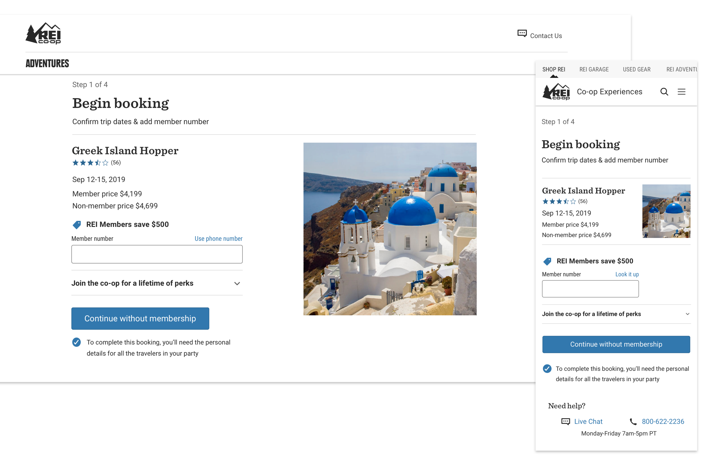
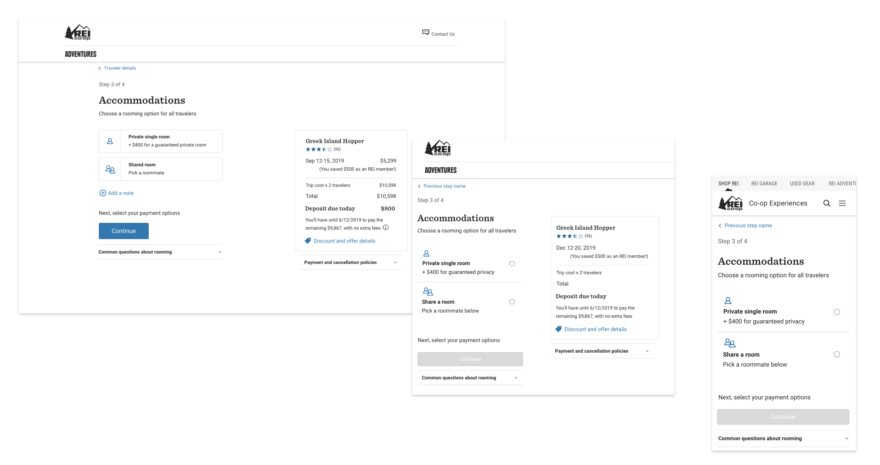
Product Design


E-Commerce Checkout design
Challenge
Over 60% of REI Adventure Travel customers choose to pay for their trip by phone, through our call center in 2018. Identify how and where the current checkout experience is discouraging customers from paying independently.
My role: Lead Product Designer & UX Researcher
Solution
Design a roburt, intuitive new Checkout experience. Through researching user patterns, stakeholder goals, and current tools, consolidate data to drive a single solution. Work with the Product Manager, sales team, technical team and our developers to test and roll out improvements.
All sensitive information has been obfusticated for client confidentiality.
Project Background
In 2018 REI Adventure Travel became an area of focus for the Co-op, with business goals to grow bookings by 25%+ annually and increase market share with younger audiences.
I identified the checkout process as a high-value UX project with strong potential for conversion gains through the elimination of several key customer pain points, particularly on mobile.
Research & Discovery phase
I began by listening in on calls coming into the sales team, hearing both staff and customer pain points on the current checkout experience. Gathering further information included referencing a previously performed useability study, studying REI's Gear and Apparel Checkout and performing a baseline study online.


Examining our data
90% of our traffic hitting the 'Booking page' after clicking 'Book now' exited the page. Looking at our exit rates farther down the path, less than 1% of users exited at the payment page of checkout, which means our problems lay in the steps before.
Desktop customers were twice as likely to successfully complete the booking and payment process as mobile users.
Baseline testing
I created a testing scenario driving users to book a trip for 5 people, a likely scenario for a family, and observed their reactions to our checkout experience.
The results were somewhat overwhelming in their negative response, which made for rich insights and some pretty good quotes:
"I am still confused about portions of what I just did."
"It's just really tedious!"
"Oh my gosh, please don't tell me I have to start over... oh, kill me now."
Additionally, 50% of the users tested failed to complete the checkout test out of sheer frustration, despite knowing they were being monitored and rewarded for completing their task.
Reducing Cognitive Load
Selecting from various options during checkout stood out during research as a confusing step where customers shared they had very low confidence they had completed the task correctly.
After analyzing processes on our competitors's site, I proposed we break checkout down into distinct steps where customers can focus on one simple decision at a time, where we can reinforce the feeling of progress after each step, and reduce cognitive load on our customers.
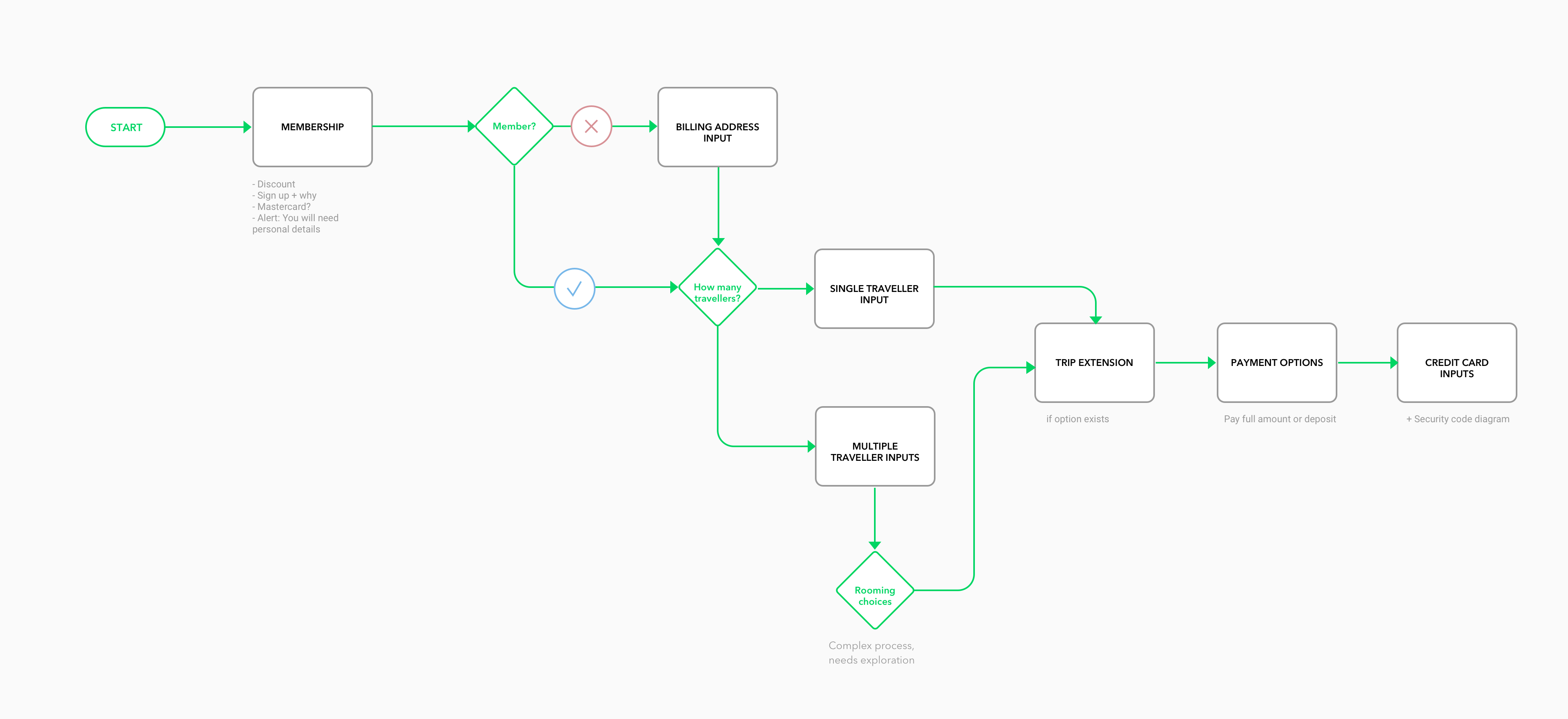

Perception of Length
In testing, we noticed customers were fatigued and frustrated by the end of the current one-page checkout process. I hypothesized that by breaking checkout into distinct sections with clear labels and iconography to communicate success, despite increase the number of steps required to finish, that customers would perceive checkout to be shorter and easier.
We tested the new designs in-person with our core audience in our Seattle flagship store: high income baby boomers. We were pleased to hear my hypothesis validated: new checkout was 'almost too easy' and made for a much happier customer at the end of their purchase completion. (Actual quote from an REI member age 73)
A better visual language
Next, I designed, iterated and tested cascading selector styles– making custom jumbo buttons on desktop for our older, core customer-base shopping on a desktop, and compact right-thumb accessible selectors on smaller screens for our growing younger customer base.
Payment content audit
Upon closer inspection, the payment section was missing some vital information:
Price reductions
For sales, discounts and underage travelers
Payment schedule
Information around final payment due
Membership savings
Showing the value of co-op membership
In addition, I identified the customers needed reduced visibility into the legal details of the cancellation policy, while retaining it's accessibility. Reducing visible content was essential to improving the cognitive load of the page on customers.
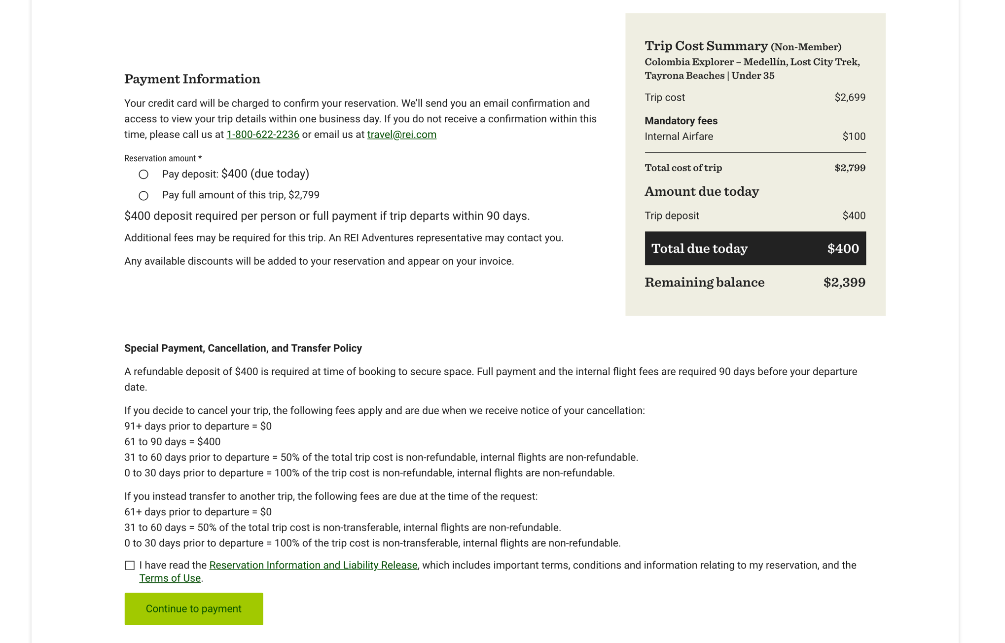

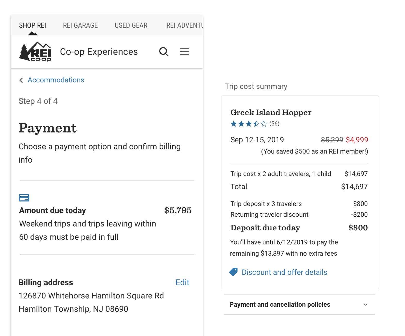

Precise payment information for your checkout
I successfully advocated for sweeping backend data changes along with this visual update, allowing us to better serve our customers.
Improvements include: communicating a precise payment timeline for your selection, showing the value of your membership discount, pricing for underage travelers and an explanation if your payment options do not include a deposit.
We also reduced complexcity by placing our cancellation policy behind an accordion.
Building confidence, validating choices
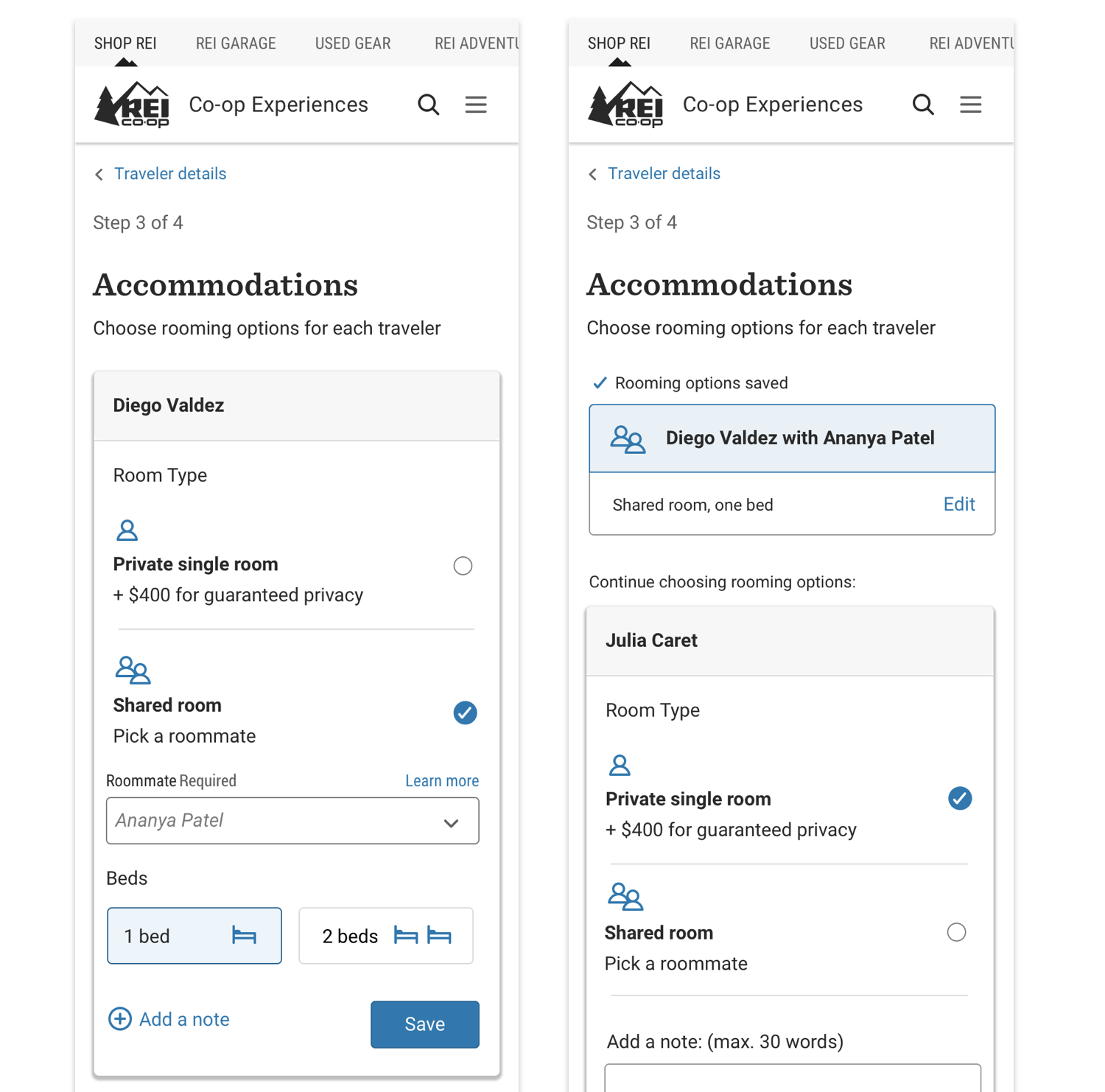
One of the loudest pain points we heard was customers feeling deeply unsure they had succeeded at their goals in checkout: accomodations and adding multiple travelers were confusing, and the repetition involved paired with redundant tasks, led to frequent frustration.
To address this, I created a visual language with small but mighty messages the entire way– validating selections customers make, step-by step, adding clear labels with strong visual hierarchy.


Confirmation page improvements
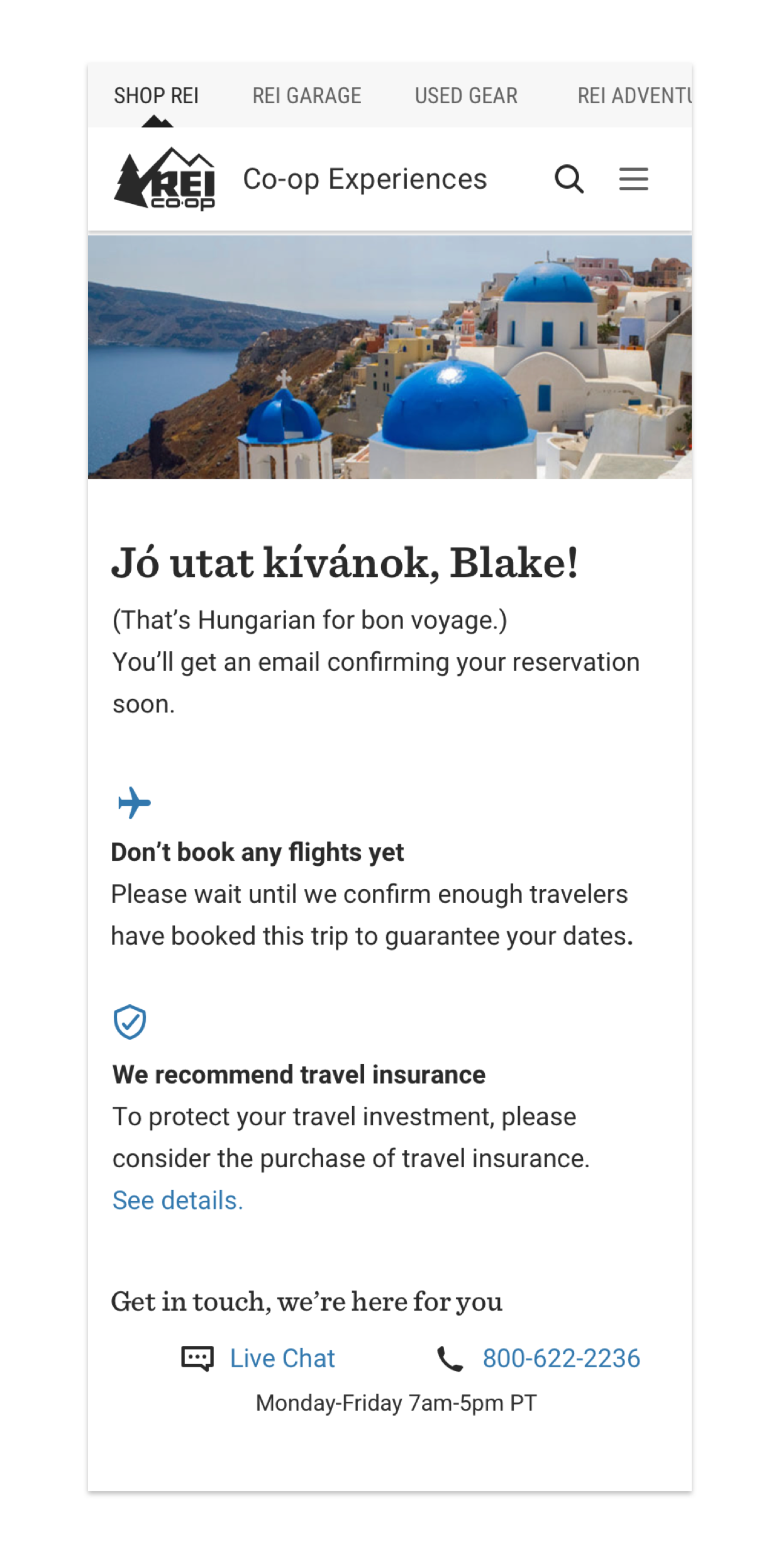
Finally, I created a stronger final moment of checkout, leaving you with a personalized, fun greeting and the strong hero image from the trip you have just booked. Helping to build this kind of excitement should increase customer satisfaction, and confidence in their choice.
Project timeline & outcomes
Started in May 2019, this design phase of this project extended through September. Another round of enhancements, driven by my research was incorporated in early 2020.
Business goals achieved:
Decrease exits in booking flow from 90% to 80%
Decrease bookings through call center (previously 37% web, 63% phone to now 25% phone, 75% web)
Customer experience goals achieved:
Decrease customer confusion (8/8 users in testing were confident about accomodation options)
Decrease customer frustrations at non-persisting checkout data
(8/8 users in testing were able to edit information in checkout)
Inclusivity outcomes:
Low-vision accessibility, all gender identities able to checkout
